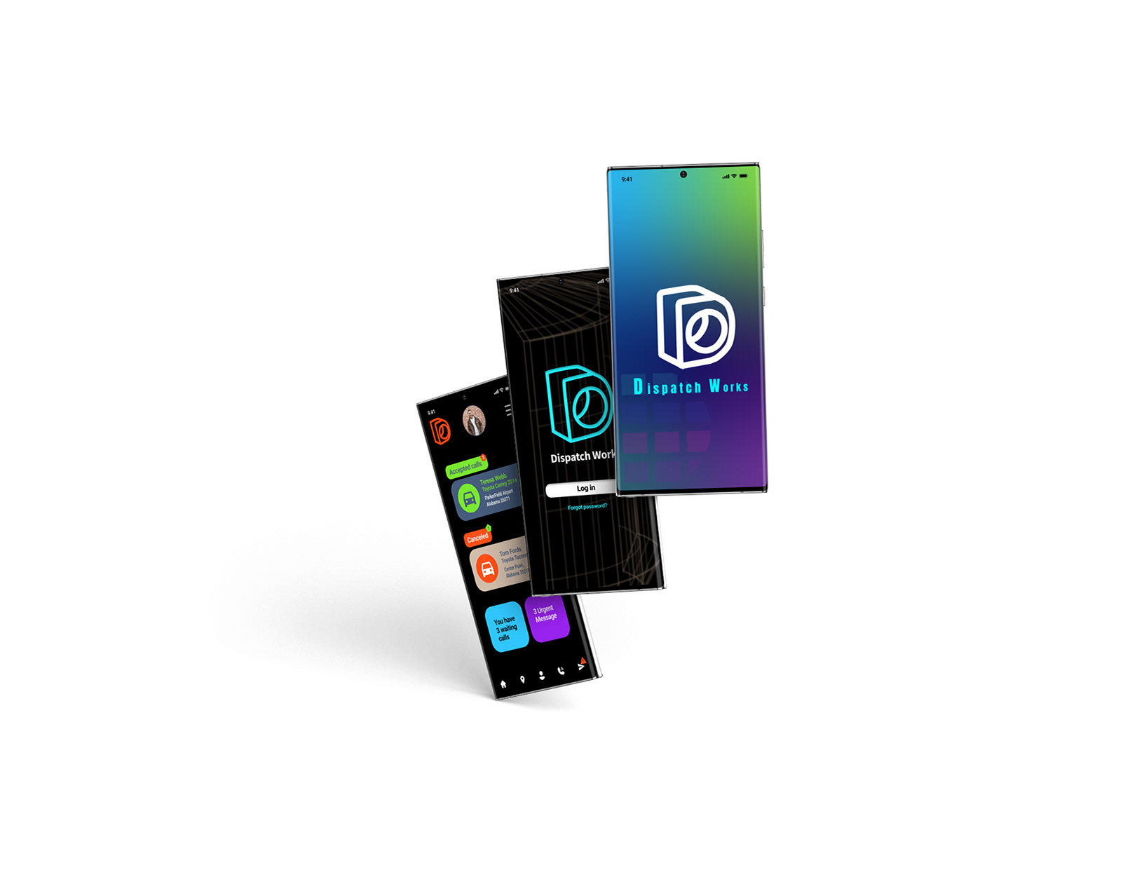
Goal- redesign logo for Slow shutter app.
Role-Redesign logo for Slow Shutter Cam App.
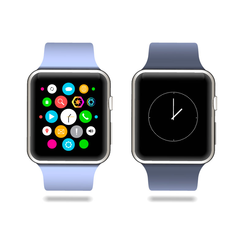
Smart watch size makes logo even smaller, very simple, robust color will only show up.
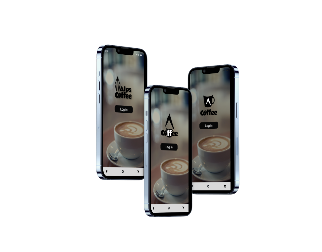
Comparing robust visual impact with redesign logos and previous one ( Far right)
App IOS has restriction of how much space needs to be all 4 sides.
Stakeholder thinks first 2 options didn't imply that rule for IOS.
I adjusted the size and kept color more vibrant and deleted 10% grey shading but he liked his fist design better.
Lesson I've learned from this project: Designer should take more time to interview stakeholder for redesign process.Radical changes can cause separation anxiety or feel too drastic. I tried to incorporate light image for lens, but slow shutter means less light coming into the lens.
